How much attention to detail do big banks take when it comes to UX?
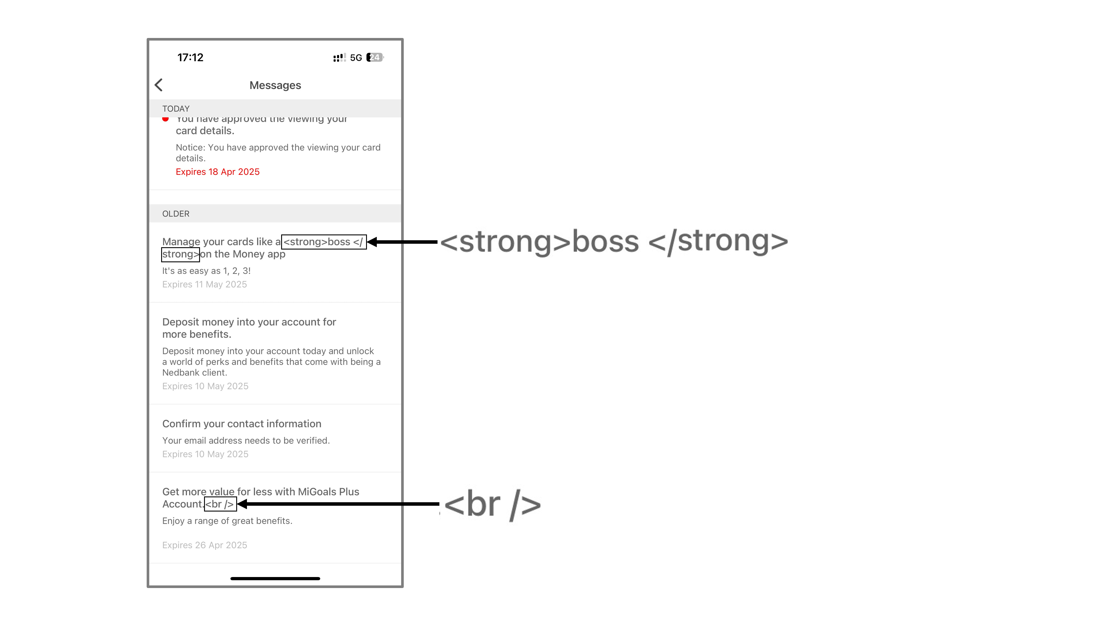
While checking my notification messages in a South African banking app, I noticed this notification:
Yes, the HTML code is showing inside the message. The issue is likely due to the notifications list rendering previews using plain text. Once you click into the full message, it renders it in the correct format.
This may seem like a minor bug, but it points to a larger issue in software development and quality assurance processes at major financial institutions. When basic text formatting issues make it through to production in consumer-facing applications, it raises questions about attention to detail.
For banks, whose core offering depends on trust and precision, these small visual errors can undermine customer confidence. The financial stakes may be small, but the perceptual impact matters.
Some potential causes for this type of issue:
- Notification preview systems not properly escaping or rendering HTML
- Content management systems allowing raw HTML in notification text fields
- Inadequate QA testing across different viewing contexts
- Lack of proper sanitization for user-facing messages
What's more concerning is that this issue persists after being reported:
The lesson here is that even when building complex financial systems, the small details matter. User experience isn't just about major features, but also the polish and attention given to every customer touchpoint.